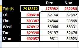
TLC? No, we haven’t gone soft. We mean Top Left Corner.
Excel 2010 finally became insert-smart a while back. Cutting a few rows offers “insert cut rows” at the cursor, and finally, after all these years, Excel does the heavy lifting for you – you no longer need to insert a bunch of rows and then populate them. It’s not seamless. Sometimes header formats can leak into the inserted rows, but we have progress.
So, why bury totals at bottom right, sometimes far (and a lot of scrolling) away?
Inserting is now easy and fast enough to insert the latest row at top, below headers, to order a sheet order “latest row at the top, earliest at the bottom”, like a good bookkeeper’s lever-arch file. Advantage? No scrolling to search for totals on row 125000. Similarly, why not sum rows on the left? Who wants to look for a total in Column XDF?
Excel doesn’t give a hoot where we put a formula, nor is it fussy which direction we use to drag months, days, weeks etc. Top left corner has the latest and greatest:

We may find this style essential when we start viewing spreadsheets on our phones.
A quad-core phone will punch through spreadsheets effortlessly. In a few years, users (not yet developers) could arrive at work with a phone instead of a laptop, dock it, and start hammering spreadsheets.
Why not? People are already toting little keyboards with their tablets, liking tablets’ all-day battery life. So, the office provides a dock, (which charges the phone), and storage on the cloud[1], and you have your own dock at home? Hmmmm …
[1] They may steal the phone, but they won’t get the data!
Bio: This article was written by Jasper Cook, Excel guru and trombonist of note.


