Traditional design tended to focus on balance and symmetrical space. However, now in 2020, the use of unbalanced space is a major design trend that is unlikely to go away anytime time soon. The reasons extend well beyond aesthetics, because asymmetrical design has some valuable (and fascinating) advantages in UI and UX, which we’ll explore in this article.
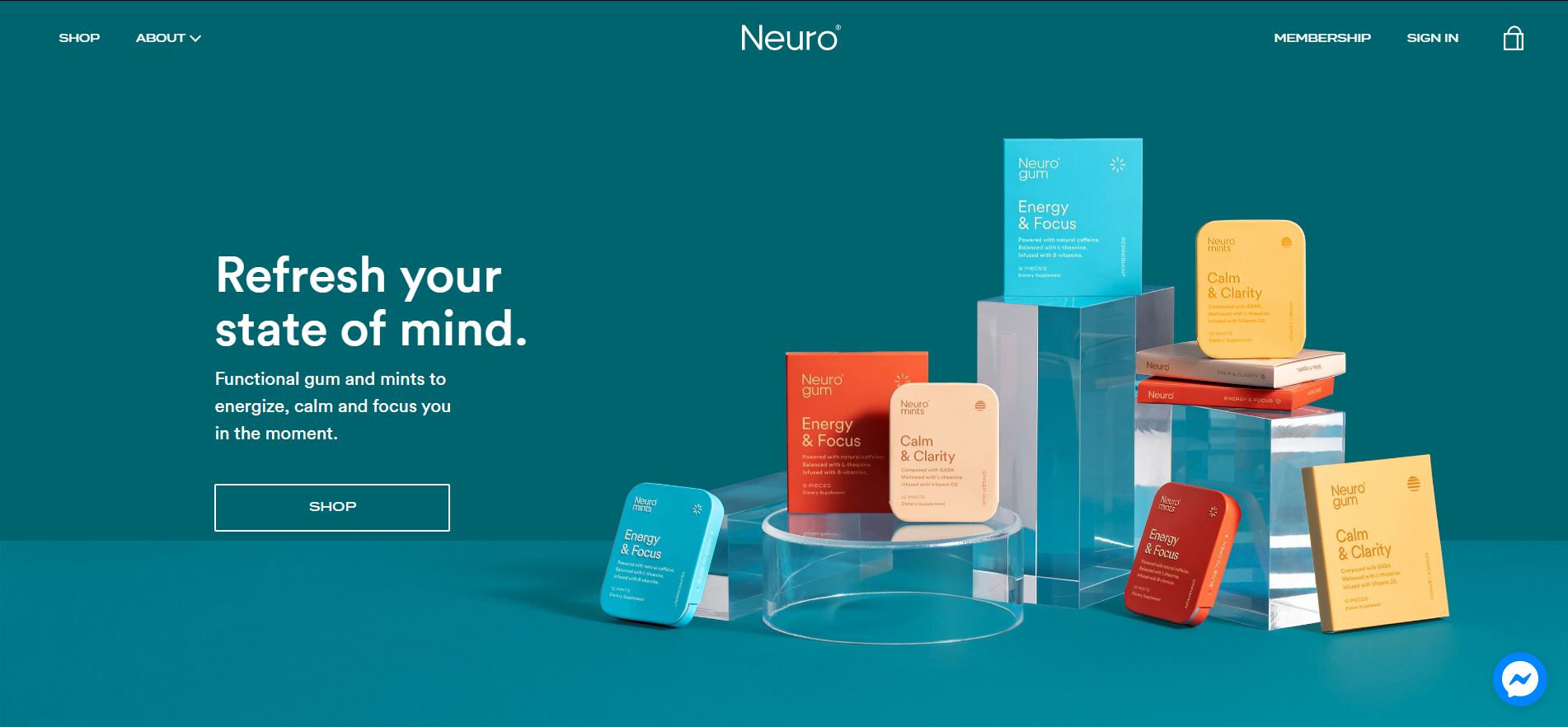
Image Courtesy of Neuro: https://getneuro.com/
Why do we use symmetry or/and asymmetry in design? The simple answer: to create more interesting compositions.
Symmetrical design
Symmetrical design refers to a visually balanced composition with equally weighted visuals on each side of an axis. As a result, symmetrical designs tend to appear more formal and can either look beautifully balanced or unvarying and dull.
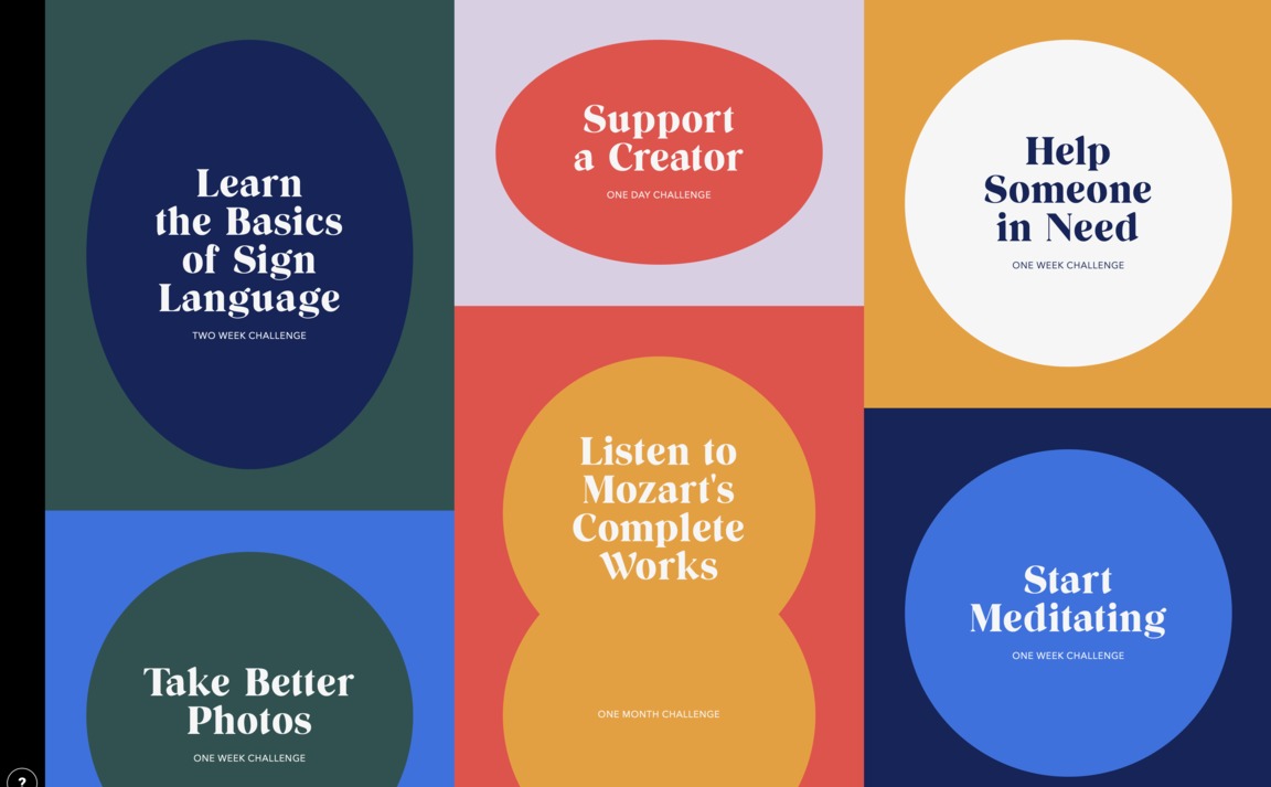
Image courtesy of Bored Solutions: https://bored.solutions/
Asymmetrical design
Asymmetrical design places unequally weighted elements in a composition. It allows for a design to contain a dominant component, which is then balanced out on the other side with some lighter elements (creating a lesser focal point). Asymmetrical design feels informal, modern and playful – and it has some valuable UI/UX advantages.
The Advantages of Asymmetrical design
UI/UX design is essentially client-centred design, and asymmetry can be used to draw in your viewer or audience. Asymmetrical design encourages the viewer to focus on areas of interest, such as text, images or patterns – anything that grabs their attention.
Asymmetrical designs also give designers the advantage of negative space, or in this case, “active whitespace”, which can guide the user’s eye to the most important areas of the webpage.
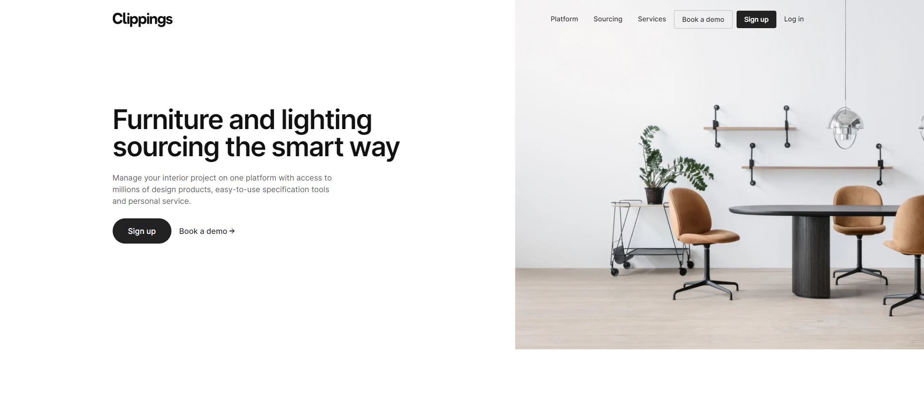
Image courtesy of Clippings: https://clippings.com/
Designs need to be interesting, dynamic and engaging. This is where visual weight comes into play: the notion that some elements in a design attract the eye more than others do. If you add visual weight to a part of your design, it will be understood as an important object in the audience’s field of view.
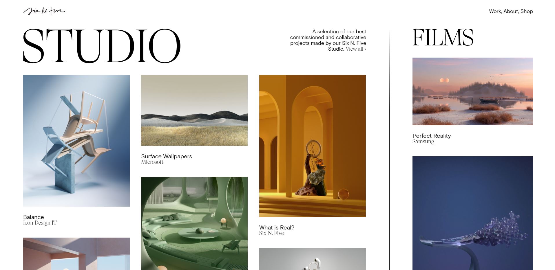
Image courtesy of Studio: https://sixnfive.com/
What is Visual Weight?
Visual weight refers to the amount of visual interest that a design element or area holds compared to the overall design composition. It is made up of seven properties, which include:
- Size: Bigger objects/elements carry more visual weight than small objects.
- Shape: The more complex the shape, the heavier it seems.
- Colour: Intensely saturated or bold, contrasting colours add more visual weight. Contrasting designs help the mind to distinguish elements, adding more interest and attention to the design.
- Negative space/Active white space: The more a designer isolates a design element, the more visual weight is added.
- Orientation: Elements that are placed diagonally (or in any uncommon placement) have more visual weight than elements placed in horizontal or vertical orientation.
- Texture: Textured elements seem heavier and more interesting than smooth surfaced elements.
- In relation to other objects: Balance the design composition by balancing one object with another (for example, using two small elements to balance out one big element).
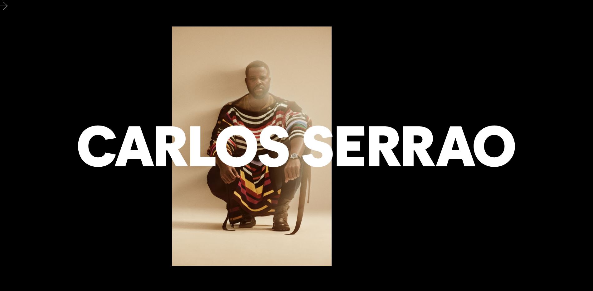
Image courtesy of Carlos Serrao: https://sixnfive.com/
A potential downside using asymmetrical designs is that, if the design elements have too much of a complex relationship with each other, they may become exhausting or even confusing for the eye to look at.
You can use a combination of symmetrical and asymmetrical designs in your composition to create a more interesting and attractive composition. It all depends on what you would like to communicate.
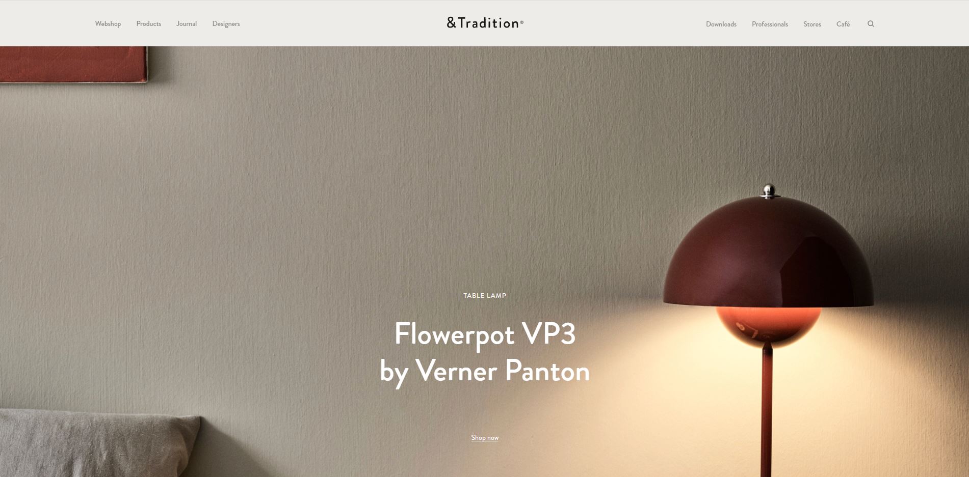
Image courtesy of &Tradition