A study from the University of Missouri reveals that it takes about 50 milliseconds (ms) (or 0.05 seconds) for users to form an impression of your website and its design. In this tiniest sliver of time, a visitor will decide whether it’s worth staying on your site. With your online presence being a fundamental expression of your brand, it is indisputable that the need for a sleek, inviting website is critical. And yet there are vast numbers of websites that miss the mark with bad design choices, inevitably resulting in fewer visitors and lost potential revenue.
It’s easy to look at a bad site and wonder what the heck happened. There could be any number of reasons why:
- The site was built in a hurry
- Design wasn’t prioritised in the budget
- The client pushed their ideas onto the project
- The designer was inexperienced or um, not a very good one
- A lack of planning and content management
- The site is simply old and outdated.
It’s worth making regular evaluations of your website to check that the design does justice to your brand and the user experience. With that in mind, here is a list (not exhaustive) of the various mistakes that can make your website unpleasant to look at and use.
1. A big, looming logo
Make the logo bigger! If every web designer had a dollar for how many times this is reqested, they’d be drinking pina coladas on private islands. There’s no question that the logo packs a powerful punch in announcing your brand when visitors arrive at your site. But a huge logo ruins the balance of a layout and pushes the page content further down. (Read this delightful rant to understand why less really IS more with logos.)
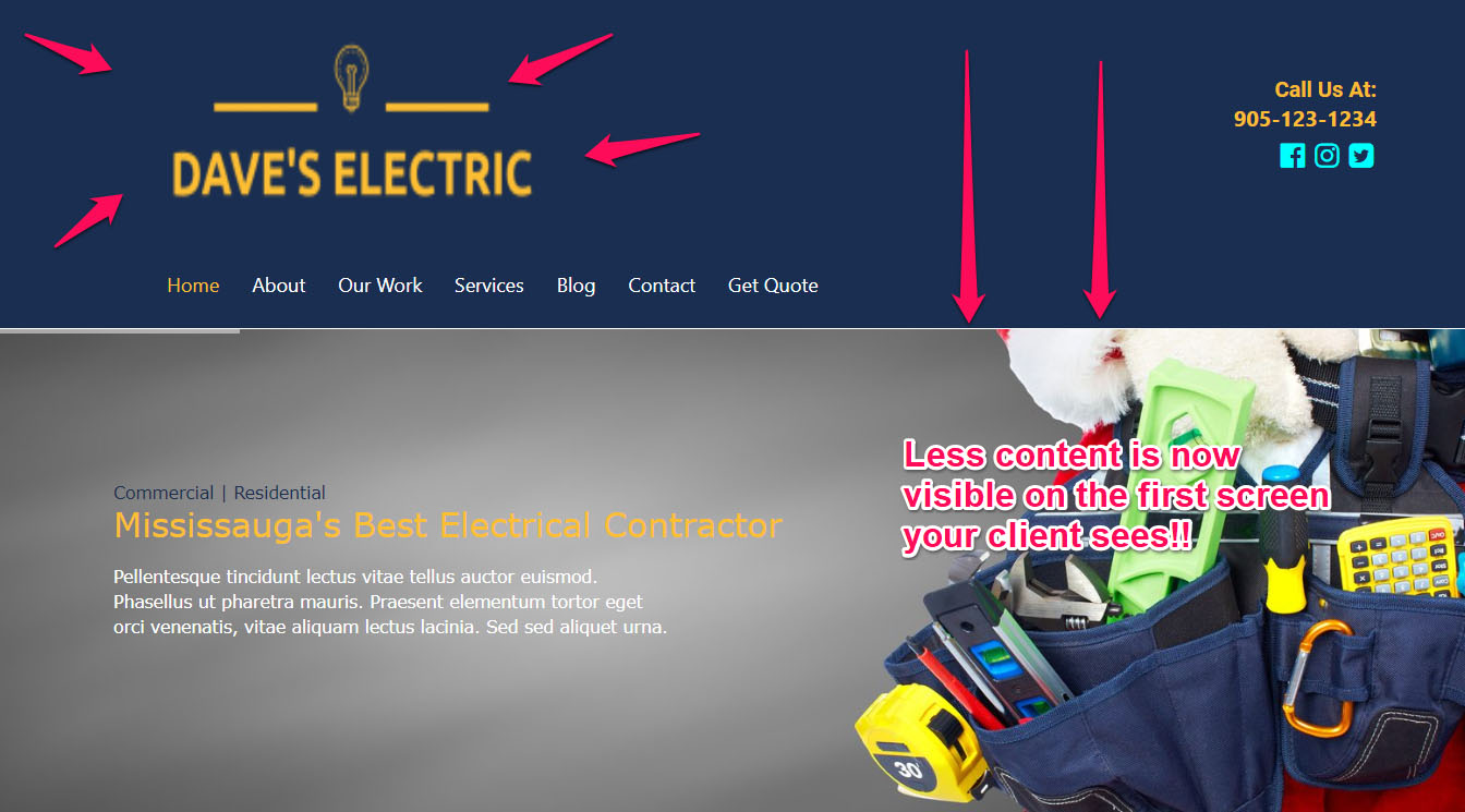
Image courtesy of iGo Sales and Marketing
2. No white/ negative space
Content needs space to breathe. Squash it up and your design will feel stifled, use too much and large, unnecessary gaps will make your site look messy and incomplete. Clients may be tempted to fit in as much text as possible, but guiding them to appreciate visual balance will present their content in a more legible and professional manner.
The layout on the left is so compact that elements feel squashed and hard to distinguish. In contrast the right-hand layout gives breathing room to these components, making it easier for visitors to focus on what’s important and, quite simply, read the content.
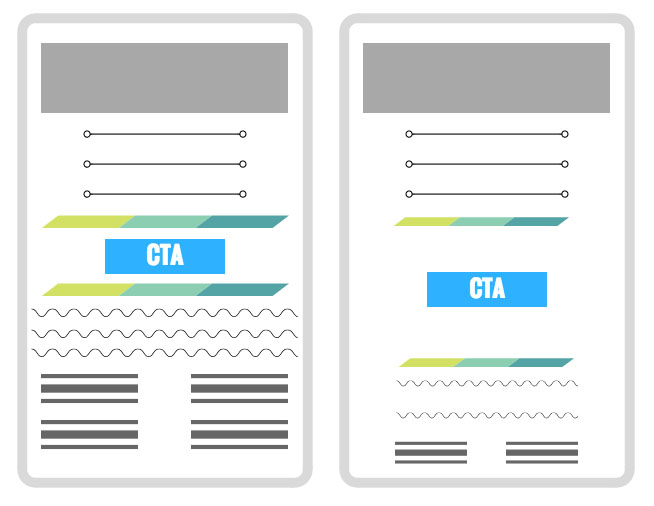
Image courtesy of HubSpot
3. Bad stock photos
Many stock photos are impersonal and clichéd. Keep it real by either using original photos of your product or company. If this is not possible, be very discerning about the stock photos you use – photos of staff grinning into their PCs comes off as plain cheesy (in fact, there are numerous articles showing just how bad stock photos can be). If you do use your own photos, make sure they look professional and not mistakenly taken by your cat.

This image looks impersonal and a bit tacky.
4. Unattractive colour palettes
Jarring colours hurt the eye and make it hard to read your content. The same applies to overusing one colour. A good designer will use a palette that complements your branding and makes it easier to use your site. For example, a call to action might pop out with an eye-catching accent colour, while the page background is a softer, less obtrusive shade. This contrast differentiates sections of content.

Image courtesy of Piccia Neri
5. Passé design elements
Websites of yore often had design elements reminiscent of old school PhotoShop effects. Bevelled buttons, harsh gradients and heavy drop shadows were the order of the day, but now these look terribly dated in relation to modern handling of these styles.
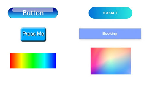
Dated button designs versus contemporary counterparts
6. Blindly following trends
Every year presents a slew of web design trends that permeate the internet. They bring welcome visual innovation and celebrate how varied and dynamic the web has become. That said, a beautiful trend is not reason enough to implement it. Countless websites have the same cookiecutter home page with a slider (that only 1% of viewers will click on). Or how about the latest trend for flat, faceless character illustrations that make your site look like a hundred others?

While not unattractive, this flat character trend is becoming overused
Image source: KindPNG
Using a trend for the sake of it can also spoil your site’s UX, with ghost buttons being a good example. They look beautifully clean and modern, but can get lost against image backgrounds or large volumes of content. As Smashing Magazine argues, ghost buttons can be misused, resulting in fewer click throughs.
This extract sums it up: “following every web design trend out there will only date your website. If you choose to follow the trends just to appease the public, you will have to change your website every time that the trends change. If you use common sense and user-friendly web design, you will be able to make your website last longer.” (source: https://faithventuremedia.com).
7. Poor navigation
First things first, the navigation should be easy to find. Users tend to prefer predictability when they make their way around your site. A hamburger menu makes sense on mobile, but risks being lost on desktop view. Minimalist styles can be guilty of oversimplifying a site’s design to a fault – for example, Marx Design may have an interesting, avant-garde design, but can you spot the menu?

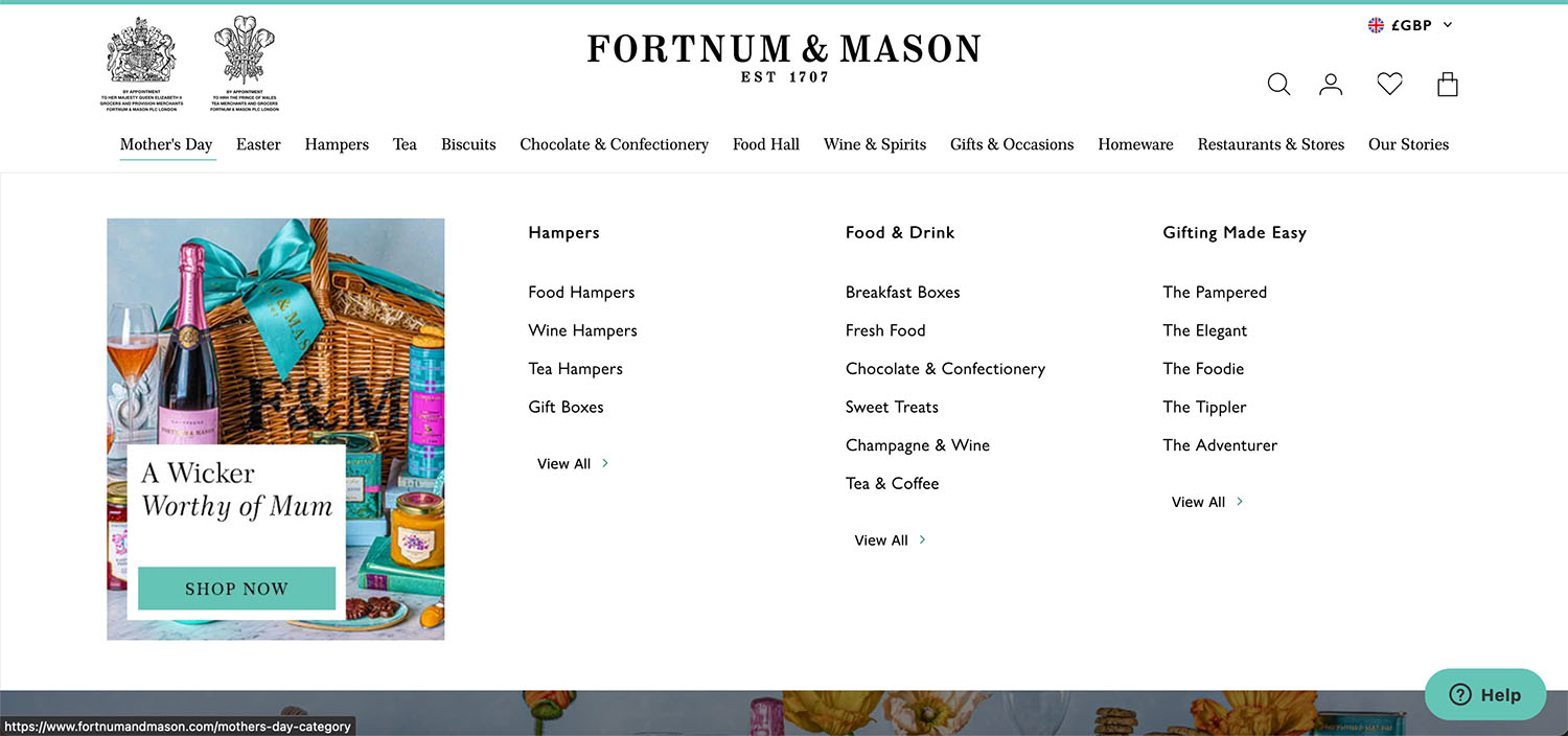
A busy menu can be equally frustrating. If you have a site with a lot of content, consider using a mega menu, rather than a merry mess of dropdowns and flyouts. Fortnum & Mason’s website is a great example:
For a more detailed analysis of good navigation design, UsabilityGeek offers some excellent guidelines.
8. Amateur typography
This topic deserves its own article (or book, for that matter). That aside, here are some common typographical errors:
- Text that is too small. Google recommends a minimum font size of 16px for body content. Consider older visitors or those with visual impairments – tiny text will leave them feeling frustrated and even discriminated against.
- Poor colour contrast that makes content near impossible to read
- Too many typefaces.
- The hierarchy of headings must be obvious, because they help to distinguish what content is the most important. This is beneficial for SEO purposes as well!
- The correct use of spacing and alignment will make your content more readable.
- Use Display and Handwritten typefaces sparingly – they are less easy to read, can look busy and overusing them will affect legibility.
This article from UX Collective presents a fantastic in-depth look at the fundamentals of web typography,
9. Poor handling of images
Tiny images are difficult to view, just as huge images take longer to load and take up real estate on your site’s layout. Make an effort to use quality images that add to the visual experience, because distorted or pixelated images look tacky and amateur. Furthermore, be selective in your choices. Too many images create visual clutter and confuse your visitor – what should they look at first?
10. Unnecessary icons
The use of icons has exploded over the past few years to the extent that they feel de rigueur on most websites. Icons can act as efficient cues, look clean and add visual interest. On the flipcoin, less recognisable icons can be open to a range of interpretations. Don’t assume that a user understands a pictogram the way you do. If you need a tooltip to explain an icon, or have a complex concept to convey, rather stick to text. In the wise words of Martin Leblanc, “a user interface is like a joke. If you have to explain it, it’s not that good”.
11. Distracting elements
A zillion pop-ups, too many videos (especially if they autoplay) and intrusive music are a sure-fire way to annoy visitors. CSS, JavaScript and SVGs have opened up spectacular opportunities to craft unique, eye-catching animations. These can add some energy and visual appeal to your site – but as with most things in life, use them in moderation. Too many flashy animations can be distracting and make it hard for visitors to engage with your content.
In summary
This synopsis of common bad design practices hopefully offers insight into mistakes we can avoid to craft attractive and usable websites. Whether a website is old or new, fundamental design principles are important to follow to get the most value out of your site.
For your perusal, here are some awful websites that are screaming for a makeover:
Yale School of Art
https://www.art.yale.edu/

The colours, the tiny text, the hyperactive animations, the busy backgrounds… for an art school, there is a disturbing lack of a pleasing visual aesthetic
Berkshire Hathaway Inc.
https://www.berkshirehathaway.com/
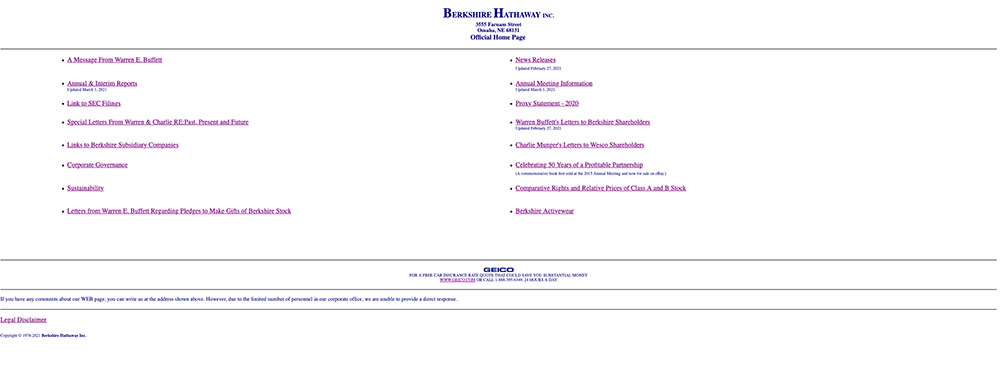
It’s baffling how a multi-billionaire company has a website that looks like it was made by someone learning HTML in the mid 90s. Appaling content structure, no navigation and a random car insurance ad are just some of the things that are very, very wrong with this site.
Riverside Art Center
https://www.riversideartcenter.org/
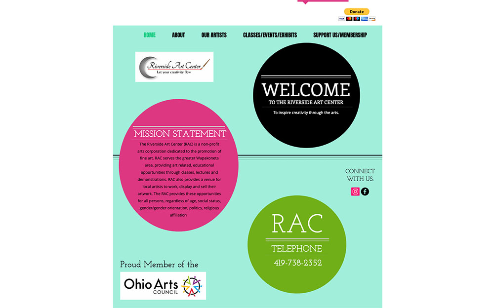
Clashing colours, weirdly centered (and often illegible) text, random shapes and a logo that looks like it was made in MS Word create a visual nightmare.
Irish Wrecks Online
http://www.irishwrecksonline.net/
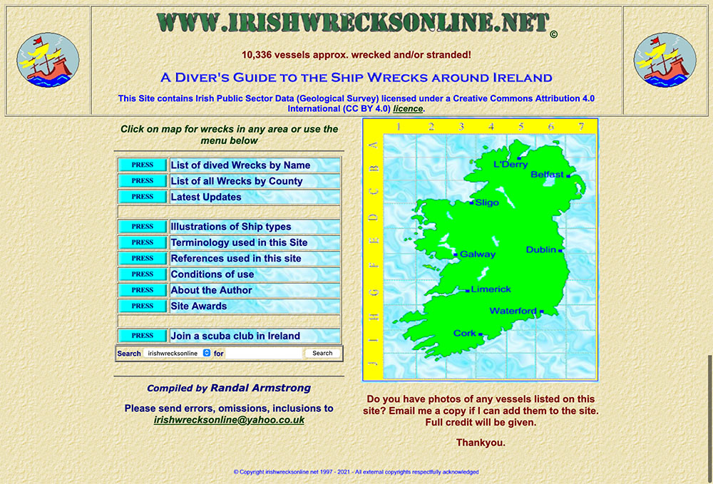
So horrendous that there’s not much more to say, other than that this site is a wreck.