For all of you who have been pushing forward with work, and were assigned to new projects BUT run out of creative juices, look no further and have a peek at these beautiful sites!
What are gradients?
Gradients are simply transitions in which colours gradually blend or transition from one colour to the next. The most visually appealing gradients tend to use complementary colours that are similar in tone and shade,folloiwng the rules of colour theory (these are colours that are opposite each other on the colour wheel).
Another important factor to consider is the feeling and emotion you want to elicit from your viewers, according to colour psychology. Bold colours create a lively feeling while pastel colours evoke calm. Remember, when it comes to gradients, the fewer colours you use the better, stick to your brands colours or simply bold, subtle colours, to avoid being visually overwhelming.
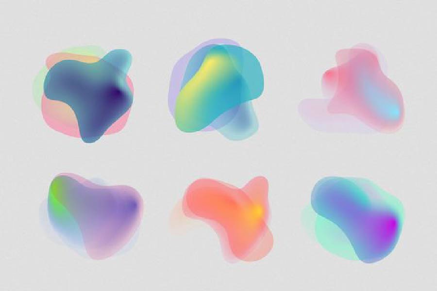
Image Courtesy of: https://www.pinterest.ru/pin/538039486728246714/
Why do we need them?
Gradients are great way to add colour and depth to a design. They’re eye-catching, attention-grabbing and can make a design stand out. Use a gradient to amplify flat designs, add some texture to backgrounds or even a colour overlay of photos. If you feel your brand or logo needs to be elevated, using gradients is a great way to add some sophistication. Perhaps you feel your logo or packaging needs to be more vibrant and eye-catching your customers attention. A splash of extra colours can add visual interest to your branding.
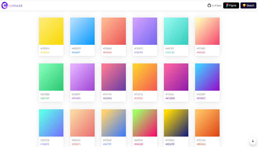
Image Courtesy of: https://webkul.github.io/coolhue/
When would you use a gradient?
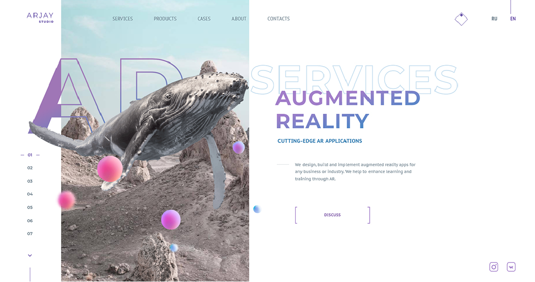
Gradients are extremely versatile in their application. They can be applied to anything, as a background or as a prime focus. They can look great on packaging, to catch the consumers eye before the other packaging does. For your logo, and perhaps use your brand colours which is also another great way you may use gradients. This way you allow your consumers to be further immersed into your brand experience. You may also use it in your marketing materials to provide a more modern feel to your brand, therefore giving the impression that your company is current with the times. For example, text elements in your UI design (like the site Arjay Studio), the background of a website, book or magazine covers, posters or even business cards.
Image Courtesy of: https://arjay.studio/#the-development-of-AR-projects
Cool resources
Without further ado, here are the brilliant sites to hlp you create eye-catching gradients:
